Podcast: Play in new window | Download
Subscribe: Apple Podcasts | Google Podcasts | Podcast Index | RSS | More
Today, we continue our series to highlight the talented speaker lineup for the upcoming Slow Flowers Summit, taking place June 28th-30th at Filoli Historic House & Garden in Woodside, California, with an extended conversation I’m excited to share with you.
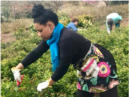
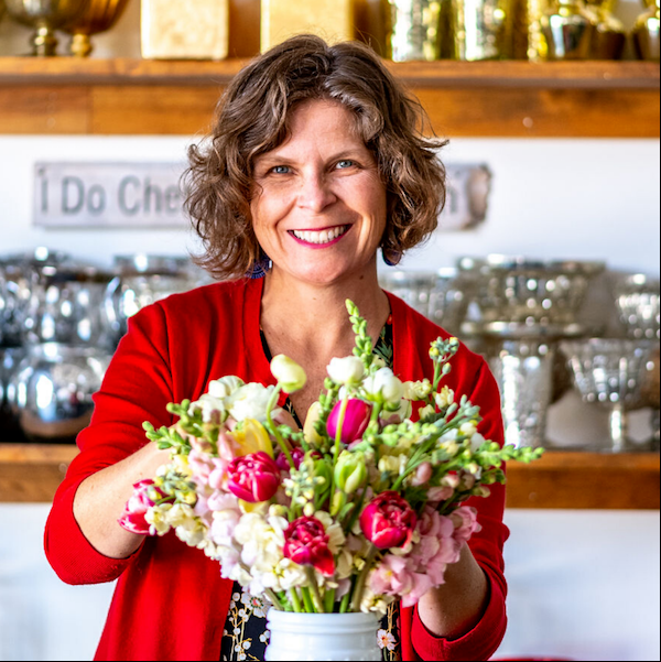
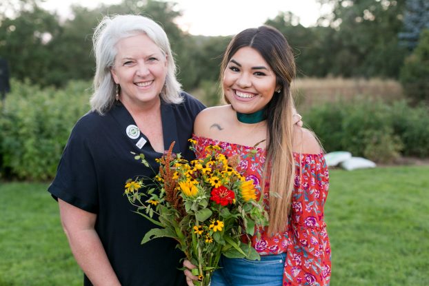
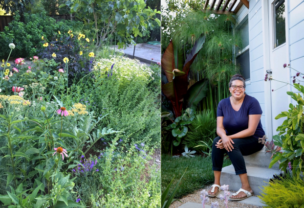
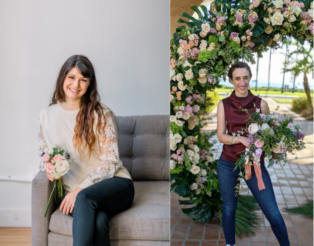
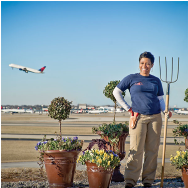
Please meet Abra Lee, horticulturist, author, speaker and founder of the media platform called Conquer the Soil. Based in Atlanta, Abra says she is a self-proclaimed horticulturist extraordinaire that is half country bumpkin, half bougie, occasionally extra, and inherently Southern. She writes: “The opportunities I’ve been fortunate to experience during my career in the garden industry have far surpassed my ancestors’ wildest dreams!”
Educated at Auburn University College of Agriculture in Auburn, Alabama with a B.S. in Horticulture and a distinguished Leadership in Public Horticulture Fellow from Longwood Gardens, Kennett Square, Pennsylvania, Abra takes notes on plants + pop culture and shares her observations across her blog and social media. Count on Abra to bring her distinct perspective to horticulture, popular culture, fashion, celebrity, and the history of Black gardeners.
Her impressive professional path began as a city arborist, which led to landscape management roles at two major international airports (in Atlanta, followed by Houston), and as a University of Georgia Extension Agent.
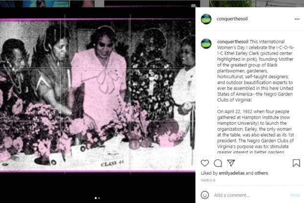
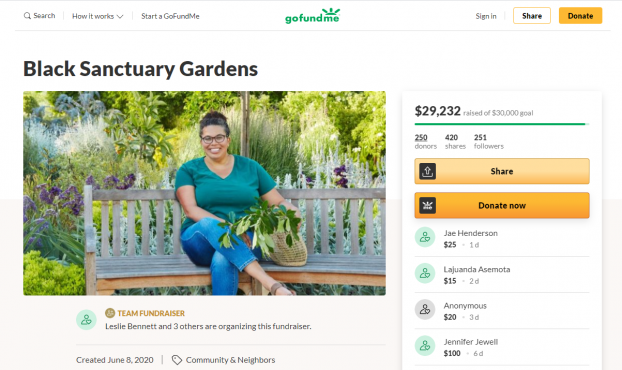
Years of research into the history of Black American gardeners propelled Abra to collect her research into a new book, scheduled for publication in the fall of 2022.
The forthcoming book is called Conquer the Soil – Black America and the Untold Stories of Our Country’s Gardeners, Farmers, and Growers
Conquer the Soil profiles 45 hidden figures of horticulture—the Black men and women whose accomplished careers in the plant world are little known or untold. Among them are Wormley Hughes, an enslaved African-American who was head gardener at Monticello and dug Jefferson’s grave; Annie Vann Reid, an ex-teacher turned entrepreneur in South Carolina who owned a five-acre greenhouse and nursery in the 1940s that sold millions of plants and seeds; and David August Williston, a graduate of Cornell University and the first African-American landscape architect, a student of Liberty Hyde Bailey, and the designer of the Tuskegee University campus. Abra’s lively text will be enriched by illustrations of each individual, making this forthcoming book as beautiful as it is critically important.
In Conquer the Soil, Abra Lee–a rising star in the plant world–gives these women and men the spotlight they deserve and enriches our collective understanding of the history of horticulture.
As we discuss in today’s epsiode, Abra has an infectous passion about the people she’s discovered through her research. She has lectured extensively on African-Americans and Ornamental Horticulture, gathering her research of 600 years of history from pre-colonial Africa to today and the artistic contributions of Black gardeners, horticulturists, educators and landscape architects to the green profession. While continuing her research for her upcoming book on the subject, Abra has unearthed an incredible narrative of Black Americans in floristry. She will share these stories of people, their flowers and their entrepreneurism in a new talk for the Slow Flowers Summit audience.
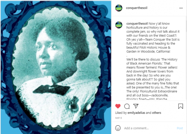
Her presentation, The History of the Black American Florist, will inspire our attendees with her storytelling gifts as she brings their untold stories to life, giving voice to the important history about Black pioneers in horticulture, floriculture, landscape architecture and botany.
Find and follow Abra Lee and Conquer the Soil at these social places:
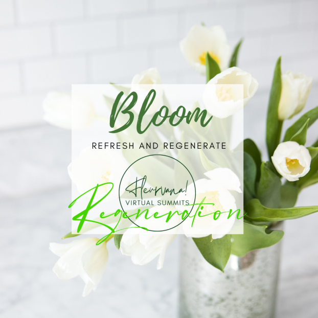
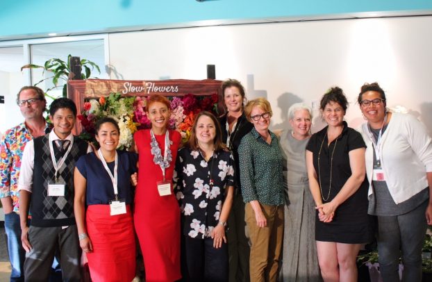
Slow Flowers Summit 2021
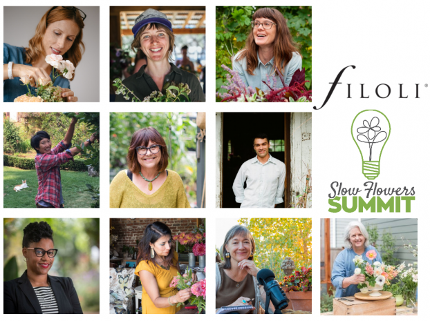
Thank you so much for joining our conversation today! There are still a few spaces left to attend the Slow Flowers Summit and you can find all those details at slowflowerssummit.com. We are so excited to welcome our attendees to a safe, in-person, COVID-compliant and mostly outdoor setting at Filoli Historic House and Garden. The countdown begins!
American Flowers Week 2021
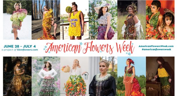
You’re hearing this Podcast on June 2nd and this week we’re kicking off the anticipation of American Flowers Week! American Flowers Week takes place June 28-July 4 each year, we’re heading into our 7th annual campaign!
Create your own American Flowers Week activities and events — use our branding, logos, free downloads and all the content available at Americanflowersweek.com to promote your floral enterprise. See the home page for our “Media Resources” and “Free Downloads” menus.
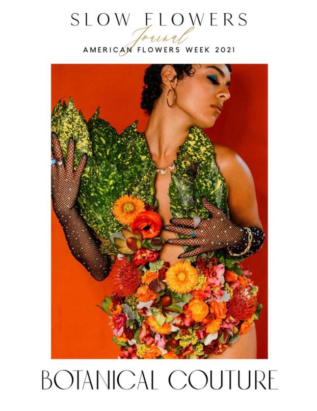
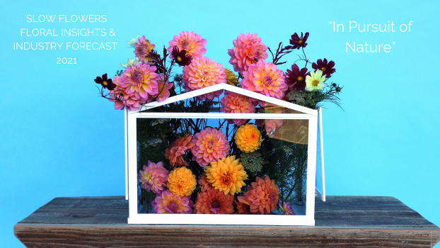
This year, Slow Flowers Society has partnered with our publishing arm, BLOOM Imprint, to produce a special Botanical Couture edition of Slow Flowers Journal. The 72-page digital magazine is available FREE to you – you’ll be inspired and amazed at the collective talent of the Slow Flowers community of creatives — flower growers, floral designers, and their teams who produced one dozen distinctly different botanical fashions. You can find the link to our special edition in today’s show notes at debraprinzing.com — and download social media graphics of each floral ensemble for your own use.
I want to share an invitation specifically for flower farmers who may be planning a special promotion, pop-up sale, workshop or other way to celebrate American Flowers Week. I’ll be writing a story about what flower farmers are doing during the campaign for an upcoming issue of Growing For Market — and I’m looking for ways to feature you and your plans. Please get in touch if you have something in the works! You can shoot me a note at debra@slowflowers.com.
Thank you to our Sponsors
This podcast is brought to you by Slowflowers.com, the free, online directory to more than 880 florists, shops, and studios who design with local, seasonal and sustainable flowers and to the farms that grow those blooms. It’s the conscious choice for buying and sending flowers.

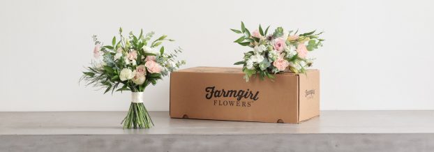
And thank you to our lead sponsor for 2021, Farmgirl Flowers. Farmgirl Flowers delivers iconic burlap-wrapped bouquets and lush, abundant arrangements to customers across the U.S., supporting more than 20 U.S. flower farms by purchasing more than $9 million dollars of U.S.-grown fresh and seasonal flowers and foliage annually, and providing competitive salaries and benefits to team members based in Watsonville, California and Miami, Florida. Discover more at farmgirlflowers.com.

For each Podcast episode this year, we thank three of our Major Sponsors:
Red Twig Farms. Based in Johnstown, Ohio, Red Twig Farms is a family-owned farm, specializing in peonies, daffodils, tulips and branches, a popular peony-bouquet-by-mail program and their Spread the Hope Campaign where customers purchase 10 tulip stems for essential workers and others in their community. Learn more at redtwigfarms.com.
Seattle Wholesale Growers Market, a farmer-owned cooperative committed to providing the very best the Pacific Northwest has to offer in cut flowers, foliage and plants. The Growers Market’s mission is to foster a vibrant marketplace that sustains local flower farms and provides top-quality products and service to the local floral industry. Visit them at seattlewholesalegrowersmarket.com.
Longfield Gardens, which provides home gardeners with high quality flower bulbs and perennials. Their online store offers plants for every region and every season, from tulips and daffodils to dahlias, caladiums and amaryllis. Check out the full catalog at Longfield Gardens at longfield-gardens.com.
Thanks so much for joining us today! The Slow Flowers Podcast has been downloaded more than 732,000 times by listeners like you. Thank you for listening, commenting and sharing – it means so much. As our movement gains more supporters and more passionate participants who believe in the importance of our domestic cut flower industry, the momentum is contagious. I know you feel it, too.
I value your support and invite you to show your thanks to support Slow Flowers’ ongoing advocacy, education and outreach activities. You can find the donate button in the column to the right at debraprinzing.com
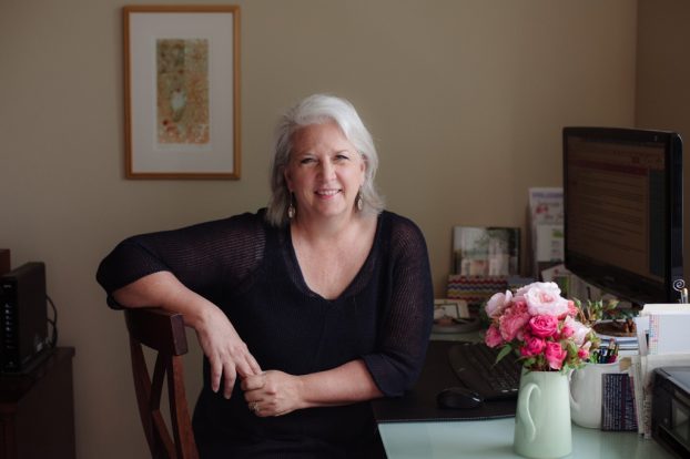
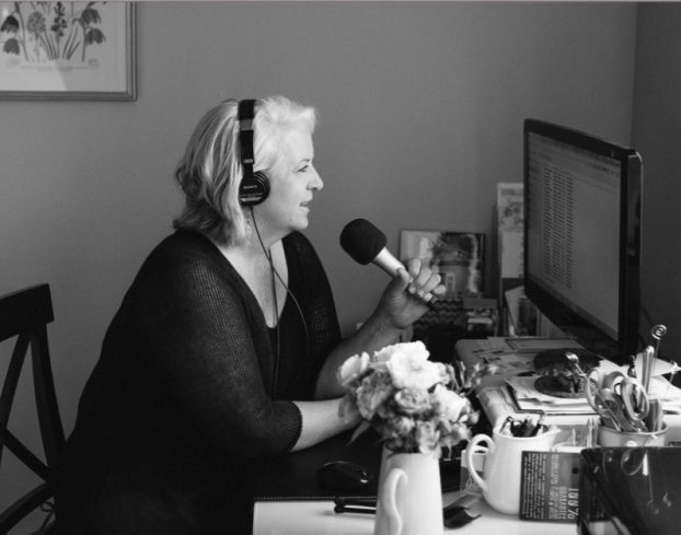
I’m Debra Prinzing, host and producer of the Slow Flowers Podcast. Next week, you’re invited to join me in putting more Slow Flowers on the table, one vase at a time. And If you like what you hear, please consider logging onto iTunes and posting a listener review.
The content and opinions expressed here are either mine alone or those of my guests alone, independent of any podcast sponsor or other person, company or organization.
The Slow Flowers Podcast is engineered and edited by Andrew Brenlan. Learn more about his work at soundbodymovement.com.
Music Credits:
Lumber Down; Heartland Flyer; Turning on the Lights; Gaena
by Blue Dot Sessions
http://www.sessions.blue
Lovely
by Tryad
http://tryad.bandcamp.com/album/instrumentals
http://creativecommons.org/licenses/by-sa/3.0/
In The Field
audionautix.com